Case Study
Reimagining B2B Signup: The Atmosphere TV Product Journey
Timeline
December 2024, Research
January 2025, Design
February 2025, Implementation
My Role
Lead designer
Developer
Atmosphere TV’s signup flow was underperforming—not because of friction, but because users didn’t understand what they were signing up for. As a hybrid product (a physical device + streaming service), it didn’t fit cleanly into existing mental models. Instead of simplifying the funnel, I added a step: a product-focused page that clarified the offering before asking for commitment.
The result? A dramatic lift in conversions, fewer drop-offs, and a clearer, more confident path to signup. This case study explores how rethinking our funnel around user understanding, not just efficiency, transformed our acquisition strategy.
Note: Some details have been modified or generalized to respect company confidentiality.
Final shipped designs for the marketing site
The Challenge
Atmosphere TV’s signup flow was underperforming and not enough visitors were converting. The issue wasn’t hidden in the data; it was clear in user behavior. People were abandoning the funnel or circling back through multiple pages, trying to piece together what exactly they were signing up for.
The problem? Our product didn’t fit into a familiar mold. Atmosphere is a hybrid offering: a physical device paired with a streaming subscription. But the existing funnel treated it like a typical SaaS signup, pushing an imediate sign up and failing to explain the value or clarify what users would receive.
As the UX lead, I needed to rethink how we presented this unique product—one that didn’t align with common mental models—and build a flow that matched how users actually evaluate purchases.
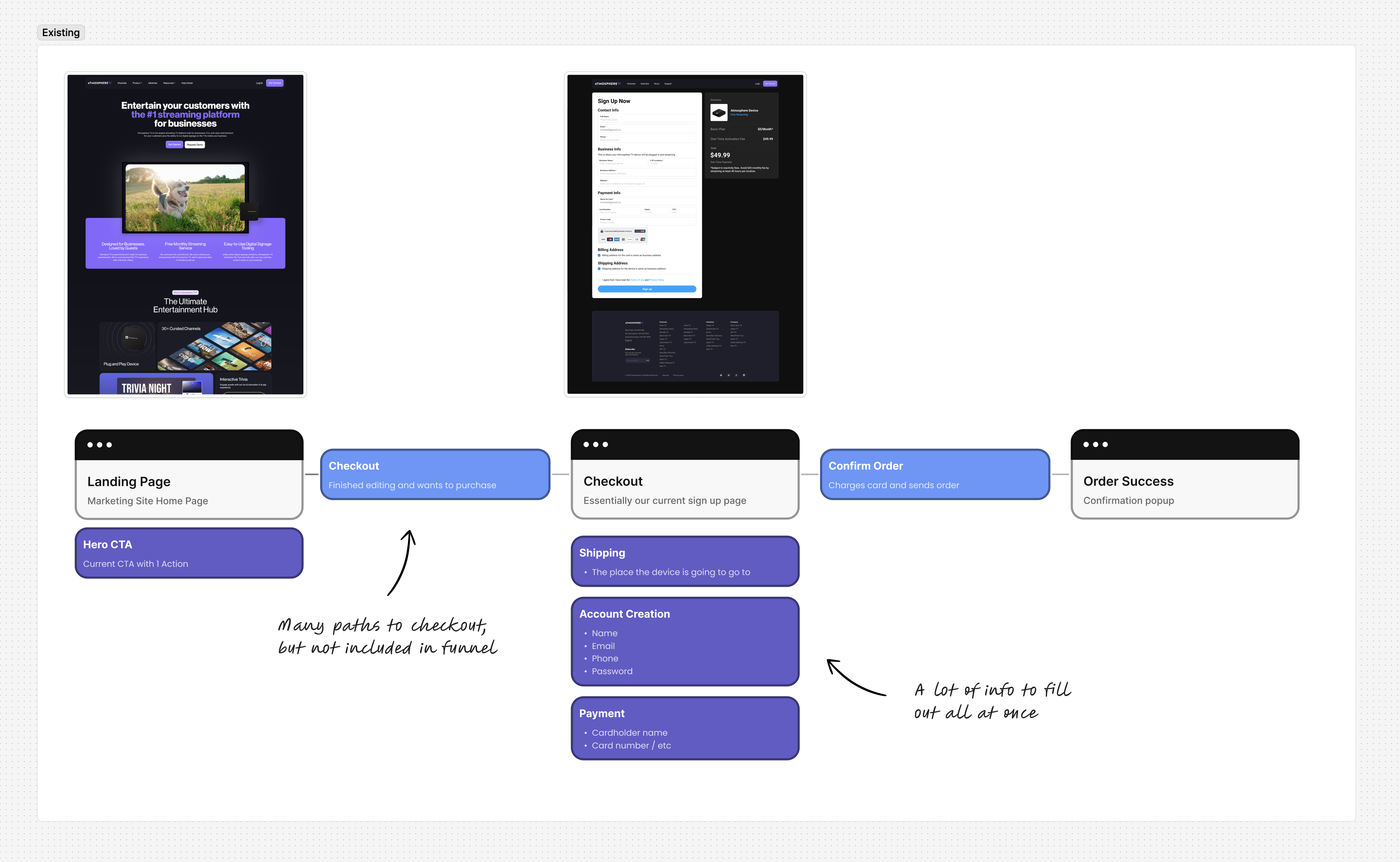
Atmosphere's previous sign up flow
Discovery Phase
Studying the best to find our path
I began by studying conversion flows across different industries, focusing on three categories:
- Subscription services (Netflix, Spotify)
- B2B products (Slack, HubSpot)
- Hardware + software products (Apple, Square, Toast)
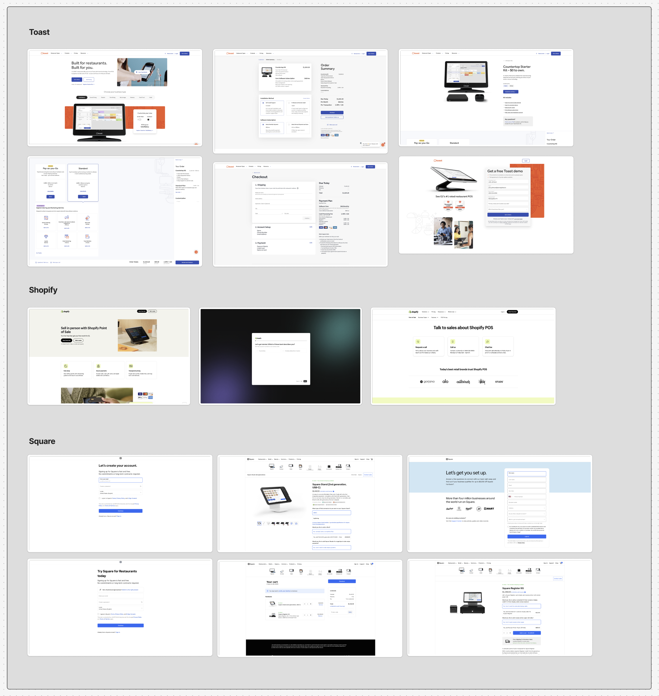
Comparable competitor product pages
What became clear was that successful hybrid products didn't rush users to signup. Instead, they created dedicated product pages that helped users understand exactly what they were getting before asking for commitment.
Looking at our own analytics, I discovered a pattern: users who eventually converted often took a circuitous path through our website, visiting multiple pages to piece together information about the product before signing up. They were creating their own "product discovery" journey because our funnel wasn't providing one.
The Hypothesis
Based on this research, I formed a counterintuitive hypothesis: Adding a step to our funnel could actually increase conversion rates.
Specifically, I proposed inserting a product details page between the landing page and signup form—giving users the information they needed before asking for commitment. This was risky because conventional wisdom suggests minimizing steps in a conversion funnel. But I believed our problem wasn't funnel length; it was insufficient information at critical decision points.
"We're not just signing users up for a service," I explained to stakeholders. "We're selling a physical product with an ongoing subscription. Users need to understand both components before they're ready to commit."
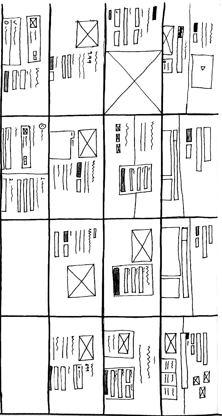
sketches of the product details page
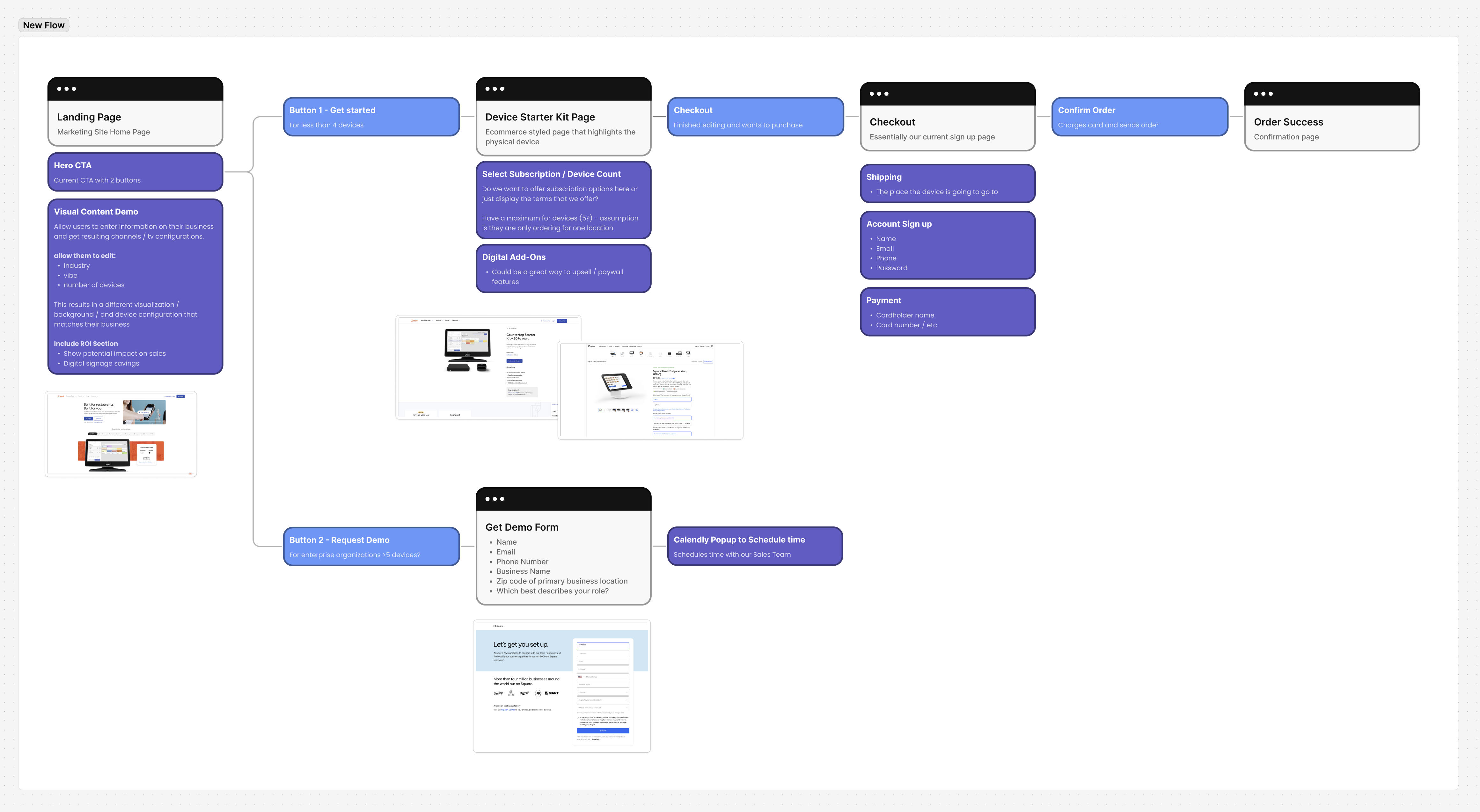
New suggested user flow
Designing the solution
Bridging Digital and Physical
Drawing inspiration from companies that successfully blend hardware and software (like Apple and Square), I designed a product-focused page that would:
- Make the process feel more like purchasing a physical product than just signing up for a subscription
- Highlight what comes in the box, creating a tangible sense of what users would receive
- Present the subscription model as a choice, similar to selecting storage capacity or color for a device
- Emphasize fast, free delivery to reduce friction for the physical component
- Showcase the benefits of Atmosphere through compelling imagery
Final product page design, including product images, reviews, and necessary details
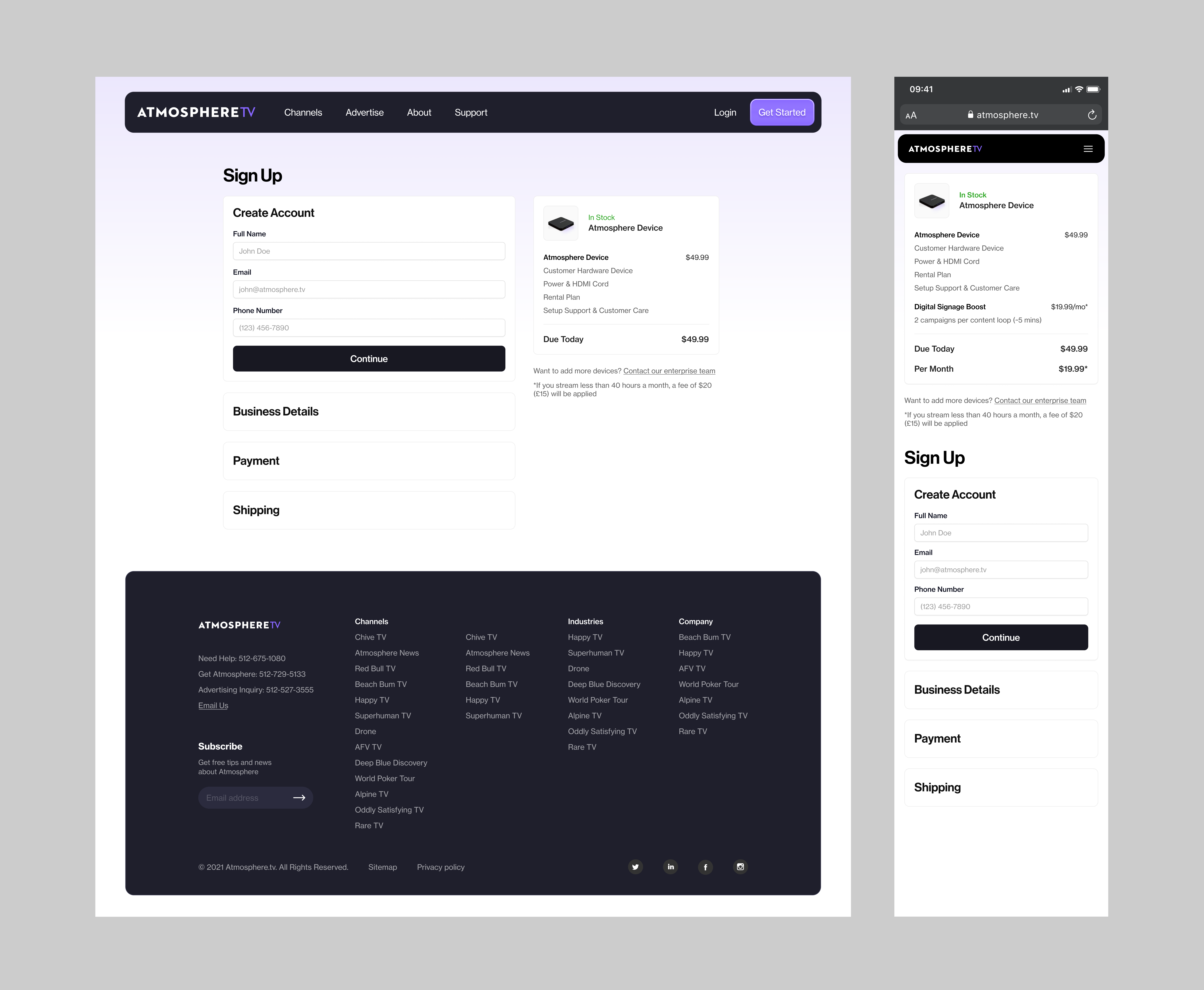
Revised sign up page with collapsed sections
Secondary Improvements
While redesigning the funnel, I also identified several opportunities for improvement:
- Segmenting the Journey: I created a separate path for enterprise customers and those who wanted a demo, recognizing their needs differed from direct purchasers
- Streamlining the Form: I reduced the visual complexity of the checkout flow by consolidating sections and using progressive disclosure
- Building Trust: I incorporated customer reviews and testimonials to create social proof
- Softening Language: I replaced "Sign Up" with "Get Started" to reduce perceived commitment and friction
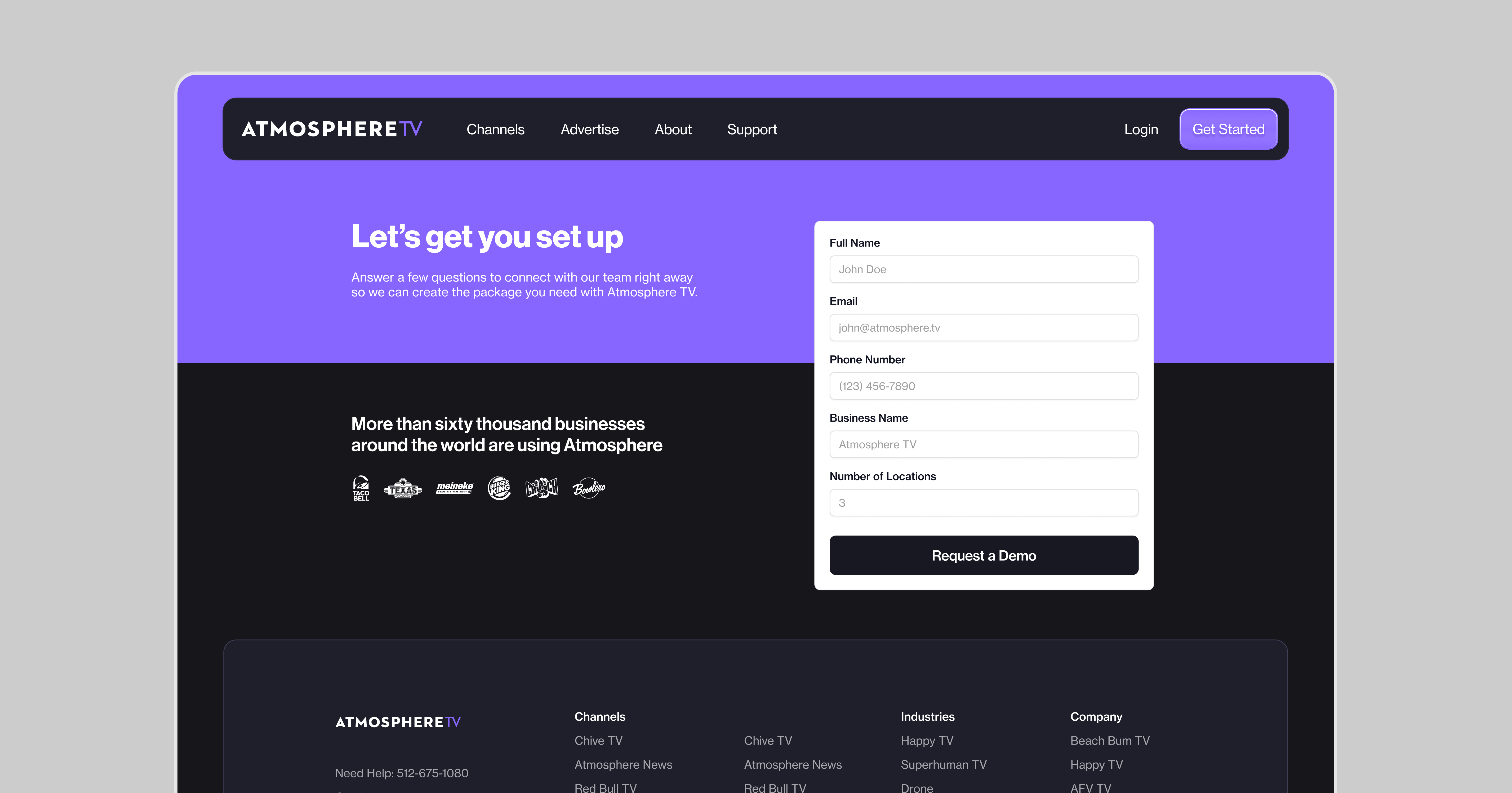
New schedule a demo page for enterprise users
A/B Testing
With the new design complete, we set up an A/B test to validate our hypothesis. The control group received our existing direct-to-form experience, while the test group encountered our new product-focused journey.
Despite adding an additional step to the funnel, I was confident that giving users the right information at the right time would increase overall conversion—even if it meant more clicks.
I told the team that if our hypothesis is right, we'll see fewer drop-offs, less back-and-forth navigation, and ultimately more signups because users will feel confident in their decision.
The Results
When the results came in, they validated our hypothesis: the new product-focused journey showed a very significant improvement in signup rates compared to the control.
What was particularly interesting was how user behavior changed:
- Users spent more time on the product page than we anticipated
- Back-and-forth navigation decreased significantly
- The percentage of users who completed the signup form after reaching it increased
- The demo page proved highly effective, converting a large portion of visitors who engaged with it.
The Broader Impact
Beyond the immediate conversion improvements, this project sparked a broader shift in how we thought about Atmosphere's customer acquisition:
- Product Identity Clarity: We gained clarity about our hybrid nature and how to communicate it effectively
- Segmented Journeys: We implemented dedicated paths for different customer types (direct purchase, enterprise, demo)
- Information Architecture: We reorganized other parts of our site to better support how users actually make decisions, such as our Channels page, or the Industry pages
Key Learnings
This project led to a bunch of takeaways for me, and really challenges some of my conventional design approaches:
- Fewer steps doesn't always mean better conversion: Sometimes users need more information, not less friction
- Hybrid products require hybrid thinking: There are situations where a cookie-cutter approach simply doesn't work and you need to break the mold a bit
- Follow the users' information needs: Analytics were a huge tool to help us uncover the specific information users were seeking, which in turn shaped the page that we added
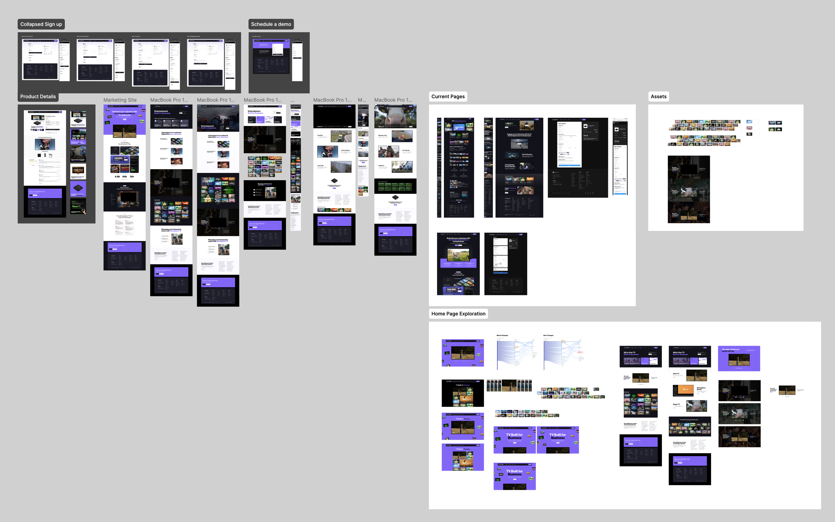
Final figma file for marketing site work
Thanks for reading till the end!
If you have any questions, please reach out to me on LinkedIn